
Photography is an art that captures a special moment and makes it last. You can easily change a simple forest shot into a deep, cinematic work with the right digital tools. These artistic enhancements allow you to add incredible depth and mystery to every single frame you capture.
Visit Lpresets.com to find professional assets that help you get this look easily. Utilizing moody lightroom editing presets helps creators stand out from others in a crowded market. They bring out the rich shadows and natural colors found in nature scenes without any extra effort.
Using a high-quality filter ensures your work looks clean and highly polished. It makes your editing work fast while keeping a high standard for your visual storytelling. Learn how these creative tools can change your style and improve your online posts right away.
The right changes make your work look professional without hours of hard labor. This comprehensive guide explores the unique impact of specific color shifts on your imagery. You will soon see how simple it is to get a high-end look for all your favorite outdoor pictures.
Key Takeaways
- Achieve a cinematic atmosphere with just one click.
- Enhance natural shadows and deep organic colors.
- Save time by using professional-grade editing tools.
- Maintain a consistent look across your entire gallery.
- Improve the look of forest and outdoor photography.
- Works seamlessly on both mobile and desktop apps.
1. Understanding the Moody Green Tone Aesthetic in Photography
In the realm of photography, the Moody Green Tone has emerged as a distinctive style, captivating audiences with its rich, cinematic quality. This aesthetic is not just a visual trend; it’s a powerful tool that photographers use to convey complex emotions and narratives through their work.
1.1 What Defines the Moody Green Color Palette
The Moody Green color palette is characterized by a dominant green tone that ranges from deep, muted forest greens to vibrant, yellowish-green hues. This palette is often associated with a sense of mystery, nostalgia, and sometimes even melancholy. The key to achieving this look lies in balancing the green tones with complementary colors and adjusting the overall contrast and exposure.
Key elements of the Moody Green color palette include:
- Dominant green tones with varying saturation levels
- Complementary colors that enhance the green hues
- Adjusted contrast and exposure for a cinematic feel
1.2 The Cinematic Origins of Green Color Grading
The use of green tones in photography has its roots in cinematic color grading. Filmmakers have long used green and other muted tones to create a specific mood or atmosphere in their films. This technique has been adopted by photographers who seek to imbue their still images with a similar cinematic quality. The Moody Green Tone preset in Lightroom is a prime example of this influence, allowing photographers to apply a film-like aesthetic to their digital photographs.
“The use of color in photography is not just about making the image look pleasing; it’s about evoking emotions and telling a story.”
1.3 Emotional Impact of Moody Green Tones
The Moody Green Tone has a profound emotional impact on viewers. It can evoke feelings of nostalgia, tranquility, or even unease, depending on the context and execution. Photographers who master this aesthetic can create images that resonate deeply with their audience, inviting them to step into the world they’ve captured.
The emotional impact of Moody Green Tones can be attributed to:
- The association of green with nature and the emotions it evokes
- The cinematic quality that adds depth to the image
- The versatility of the aesthetic in conveying different moods
By understanding the Moody Green Tone aesthetic, photographers can harness its power to create compelling, emotionally resonant images that stand out in a crowded visual landscape.
2. Benefits of Using Moody Green Tone Preset Lightroom
For photographers looking to streamline their post-production workflow, the Moody Green Tone Preset offers a versatile and efficient solution. By utilizing the Lightroom presets moody green tones, photographers can achieve a consistent and professional look across their portfolio.
The benefits of using these presets are multifaceted. Not only do they enhance the aesthetic appeal of the images, but they also significantly reduce the time spent on editing.
2.1 Consistent Professional Results Across Your Portfolio
One of the primary advantages of using the best lightroom presets for green tones is the ability to achieve consistent professional results. By applying the same preset to multiple images, photographers can maintain a cohesive look throughout their portfolio.
This consistency is particularly important for photographers who regularly post their work on social media or use it for commercial purposes.
2.2 Time Efficiency in Post-Production Workflow
The Moody Green Tone Preset significantly enhances time efficiency in post-production. By applying a preset, photographers can instantly transform their images, saving hours of manual editing time.
This efficiency allows photographers to focus on other aspects of their work, such as capturing new images or interacting with clients.
2.3 Versatility for Different Photography Styles
Despite its specific aesthetic, the Moody Green Tone Preset is surprisingly versatile and can be used across different photography styles. Whether you’re shooting landscapes, portraits, or urban scenes, this preset can add a unique and captivating touch to your images.
Photographers can visit Lpresets.com to explore a wide range of presets, including the Moody Green Tone Preset, and discover how they can enhance their photography.
3. Choosing the Right Preset from Lpresets.com
Choosing the ideal moody green preset from Lpresets.com involves understanding your photography style and the mood you want to convey. With a wide array of moody green tone preset Lightroom options available, it’s essential to navigate through the collections effectively.
3.1 Overview of Moody Green Preset Collections
Lpresets.com offers a diverse range of professional Lightroom presets green tones designed to cater to various photography styles. Their collections include presets that can add a cinematic touch to your photos, enhance the natural beauty of landscapes, or create a moody atmosphere in portraits.
The collections are carefully curated to ensure that each preset can be easily customized to fit your specific needs. Whether you’re looking for a subtle green tone or a more dramatic effect, Lpresets.com has a preset that can help you achieve your desired look.
3.2 Matching Presets to Your Photography Style
To get the most out of the moody green tone preset Lightroom, it’s crucial to match the preset to your photography style. For instance, if you specialize in landscape photography, you might prefer presets that enhance the natural colors and add depth to your images.
On the other hand, if you’re a portrait photographer, you might look for presets that create a moody atmosphere without overpowering the subject’s skin tones. Lpresets.com provides detailed descriptions of their presets, making it easier to find the one that suits your style.
3.3 Free versus Premium Preset Options
Lpresets.com offers both free and premium professional Lightroom presets green tones. The free options are a great starting point for those new to using presets or looking to experiment with different styles.
However, the premium presets offer more advanced features and customization options. They are ideal for professionals looking for a specific look that can be achieved with a single click. When deciding between free and premium, consider your budget and the level of customization you need.
4. Installing Your Moody Lightroom Editing Presets
Installing your moody lightroom editing presets is a straightforward process that can elevate your photo editing workflow. To get started, you’ll need to download the presets from Lpresets.com and then install them in your Lightroom application.
4.1 Downloading Presets from Lpresets.com
The first step in installing your moody green tone presets is to download them from Lpresets.com. This process involves creating an account and navigating the preset library.
4.1.1 Creating Your Account
To download presets from Lpresets.com, you need to create an account. This involves:
- Visiting the Lpresets.com website
- Clicking on the “Sign Up” or “Register” button
- Providing the required information, such as your name and email address
- Verifying your email address through a confirmation link sent by Lpresets.com
4.1.2 Navigating the Preset Library
Once your account is set up, you can navigate the preset library to find your desired moody green tone presets. The library is typically organized by categories, making it easier to find presets that match your photography style.
4.2 Installing in Lightroom Classic
After downloading your presets, the next step is to install them in Lightroom Classic. There are two methods to do this: using the Import Presets function or manual installation.
4.2.1 Using the Import Presets Function
Lightroom Classic offers an Import Presets function that simplifies the installation process. To use this function:
- Open Lightroom Classic
- Go to the Develop module
- Right-click on the Presets panel and select “Import Presets”
- Navigate to the location where you downloaded your presets and select the file
- Click “Import” to complete the process
4.2.2 Manual Installation Method
If you prefer a more hands-on approach, you can manually install your presets. This involves:
- Locating the Lightroom settings folder on your computer
- Copying the downloaded preset files into the “Develop Presets” folder
- Restarting Lightroom Classic to see the newly installed presets
4.3 Installing in Lightroom CC and Mobile
For users of Lightroom CC and Mobile, the installation process is slightly different but equally straightforward. You can sync your presets across devices using your Adobe Creative Cloud account.
By following these steps, you can successfully install your moody green tone presets in Lightroom, whether you’re using Lightroom Classic, CC, or the mobile app. This will enable you to apply your chosen green lightroom filters to your photos efficiently.
5. Preparing Your Photos for Green Color Grading Lightroom
To achieve the best results with green color grading in Lightroom, it’s essential to prepare your photos properly. This preparation involves several key steps that will ensure your images respond well to the moody green tone presets.
5.1 Selecting Images That Work Best with Green Tones
Not all photographs are suitable for green color grading. Images with lush vegetation, misty landscapes, or urban scenes with greenery tend to work exceptionally well. When selecting images, consider those with a natural palette that includes various shades of green.
- Landscapes with dense foliage
- Forest scenes with mist or fog
- Urban photography with green accents
5.2 Understanding Lighting Conditions and Color Temperature
Lighting conditions and color temperature play a crucial role in how well your photos will respond to green tone presets. Images shot during the golden hour or in overcast conditions often have a natural warmth or coolness that can be enhanced with green grading.
Understanding the color temperature of your image is vital. For instance, images with a cooler tone can be more receptive to green grading. Adjusting the white balance can also help in achieving the desired moody effect.
5.3 Organizing Your Workflow in Lightroom
Organizing your workflow is crucial for efficient editing. Create a collection specifically for images intended for green color grading. This helps in keeping your workflow streamlined and makes it easier to apply presets and adjustments across multiple images.
Use Lightroom’s organizational tools like flags, ratings, or color labels to categorize your images based on their potential for green tone enhancement.
6. Step-by-Step Guide to Applying Dark Green Lightroom Presets
To give your images a cinematic look, follow our step-by-step guide on applying Dark Green Lightroom Presets. This process is straightforward and can significantly enhance your photography workflow.
6.1 Importing Your Images into Lightroom
The first step in applying a Dark Green Lightroom Preset is to import your images into Lightroom. To do this, navigate to the Library module and click on “Import.” Select the folder containing your images and choose the desired import settings.
Ensure your images are properly organized and easily accessible within Lightroom to streamline your editing process.
6.2 Applying the Preset with One Click
Once your images are imported, you can apply the Dark Green Lightroom Preset with just one click. This simplicity is one of the key benefits of using presets.
6.2.1 Locating Your Installed Presets
To locate your installed presets, go to the Develop module and find the Presets panel on the left side. Your Dark Green Lightroom Presets should be listed here, ready for application.
6.2.2 Previewing Before Applying
Before applying a preset, you can preview how it will look by hovering over the preset name. Lightroom will show a preview of the effect on your image, allowing you to choose the most suitable preset.

6.3 Adjusting Preset Intensity Using the Amount Slider
After applying the preset, you may want to adjust its intensity. Lightroom allows you to do this using the Amount slider, which is available when you have applied a preset. Adjusting the intensity can help you achieve the perfect balance for your image.
6.4 Evaluating the Initial Results
Once you’ve applied and adjusted the Dark Green Lightroom Preset, evaluate the initial results. Check if the preset has achieved the desired moody green tone and if further adjustments are needed.
By following these steps, you can effectively apply Dark Green Lightroom Presets from Lpresets.com to your images and enhance your photography with a moody aesthetic.
7. Customizing and Fine-Tuning Green Lightroom Filters
To achieve the perfect moody green tone in your photos, it’s essential to customize and fine-tune the Green Lightroom filters according to your image’s specific needs. This process involves making several key adjustments to enhance the overall look and feel of your photographs.
7.1 Adjusting Basic Exposure and Contrast Settings
Before diving into the specifics of green tone refinement, it’s crucial to get the basics right. Adjusting exposure and contrast lays the foundation for a well-balanced image.
7.1.1 Balancing Highlights and Shadows
Balancing highlights and shadows is vital for creating a natural-looking image. By adjusting these settings, you can recover lost details in both bright and dark areas, ensuring your image looks more nuanced.
7.1.2 Enhancing Whites and Blacks
Enhancing whites and blacks further refines the contrast in your image. This step helps in creating a more defined and crisp look, making your photos stand out.
For instance, consider the following adjustments:
| Adjustment | Purpose | Effect |
|---|---|---|
| Exposure | Brighten or darken the image | Improves overall brightness |
| Contrast | Adjust the difference between light and dark | Enhances image depth |
| Highlights | Recover details in bright areas | Prevents overexposure |
| Shadows | Reveal details in dark areas | Adds depth to shadows |
7.2 Refining Green Tones in the HSL Panel
The HSL (Hue, Saturation, Luminance) panel is a powerful tool for refining green tones in your images. By making targeted adjustments, you can achieve a more nuanced and natural-looking green tone.
7.2.1 Adjusting Hue for Different Green Shades
Adjusting the hue allows you to shift the green tones to different shades, from yellow-green to blue-green. This flexibility is crucial for matching the green tone to your image’s specific context.
7.2.2 Controlling Saturation Levels
Controlling saturation levels helps in making the green tones more or less vibrant. Desaturating can create a more muted, moody effect, while increasing saturation can make the greens pop.
7.2.3 Modifying Luminance for Depth
Modifying luminance adjusts the brightness of the green tones, adding depth and dimension to your image. This adjustment can help in creating a more balanced and visually appealing green tone.
As noted by a renowned photographer, “The key to a great image is not just in capturing it, but in processing it to bring out the desired mood and atmosphere.”
“The art of photography is not just about capturing reality, but about interpreting it.”
7.3 Working with the Tone Curve for Moody Effects
The Tone Curve is another essential tool for creating moody effects with green tones. By adjusting the curve, you can fine-tune the contrast and exposure in specific tonal ranges, adding complexity to your image.
7.4 Preserving Skin Tones in Portraits
When working with green tones, it’s essential to preserve natural skin tones in portraits. This involves making subtle adjustments to ensure that the green tone enhancement doesn’t adversely affect the subject’s skin.
By following these steps and making thoughtful adjustments, you can effectively customize and fine-tune your Green Lightroom filters to achieve professional-looking results with your moody green tone presets from Lpresets.com.
8. Advanced Techniques for Professional Lightroom Presets Green Tones
Advanced techniques for using professional Lightroom presets green tones can transform your photography, giving it a cinematic and moody atmosphere. By mastering these techniques, you can significantly enhance the visual impact of your photos.
To achieve professional-grade results, it’s essential to go beyond basic preset application and explore more sophisticated editing methods. Lpresets.com offers a range of tools and presets that can help you achieve this level of editing.
8.1 Using Color Grading Panels for Selective Adjustments
Color grading is a powerful tool in Lightroom that allows for precise control over the color and tone of your images. By using the Color Grading panel, you can make selective adjustments to different parts of your image.
8.1.1 Targeting Shadows with Green Tones
One effective technique is to target the shadows with green tones, adding depth and a moody atmosphere to your photos. This is achieved by adjusting the shadows in the Color Grading panel, where you can introduce a green hue to enhance the overall aesthetic.
For example, in a landscape photo, adding a green tone to the shadows can make the foliage appear more vibrant and immersive.
8.1.2 Balancing Highlights and Midtones
Balancing highlights and midtones is crucial for creating a natural-looking image. By adjusting these elements in the Color Grading panel, you can ensure that your image retains detail in both bright and mid-tone areas.
8.2 Creating Depth with Split Toning Techniques
Split toning is another advanced technique that can add depth and interest to your images. By applying different tones to the shadows and highlights, you can create a more dynamic and visually appealing photo.
This technique is particularly effective when used with moody green photo filters, as it allows for a nuanced control over the color palette.
8.3 Applying Local Adjustments with Masks
Local adjustments are essential for fine-tuning your image. By using masks, you can apply specific edits to particular areas of your photo, ensuring that the overall image looks balanced and polished.
8.3.1 Radial and Gradient Filters
Radial and gradient filters are powerful tools for applying local adjustments. They allow you to selectively adjust exposure, contrast, and color in specific areas of your image.
For instance, a radial filter can be used to draw attention to a particular subject by adjusting the exposure and contrast around it.
8.3.2 Brush Adjustments for Precision
Brush adjustments offer the most precision when it comes to local editing. By using the adjustment brush, you can make targeted edits to very specific areas of your image, ensuring that your edits look natural and seamless.
This level of precision is particularly useful when working with portraits or complex scenes where subtle adjustments can make a significant difference.
9. Best Photography Subjects for Moody Green Photo Filters
Moody green photo filters can transform various photography subjects, elevating their aesthetic appeal. The versatility of the moody green tone allows it to be applied across different genres, from landscapes to portraits, and even product photography.

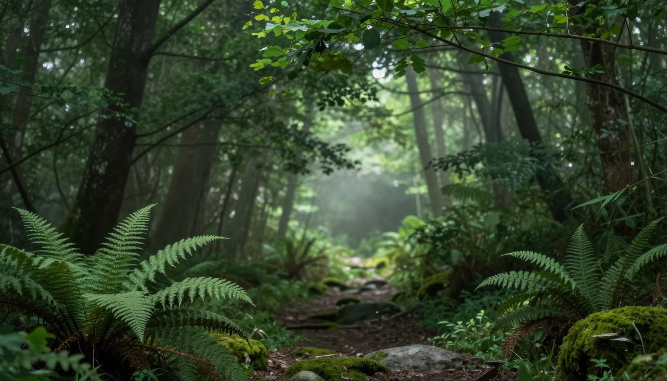
Landscape and Forest Photography
Landscape and forest photography are among the most suitable subjects for moody green Lightroom presets. The green tones enhance the natural beauty of foliage, creating a dramatic and immersive atmosphere. Forests, in particular, benefit from the moody green aesthetic, as it accentuates the mystery and depth of woodland scenes.
Urban and Architectural Scenes
Applying moody green photo filters to urban and architectural photography can add a unique twist. It introduces a contrast between the natural green tones and the urban landscape, creating visually striking images. This contrast can highlight the interplay between nature and urban development.
Portrait Photography with Moody Atmosphere
In portrait photography, moody green tones can create a captivating atmosphere. The green hue can complement skin tones and add depth to the image. It’s particularly effective in creating a moody, cinematic look that draws the viewer’s attention. As photographer
“The key to a great portrait is not just the subject, but the atmosphere that surrounds them.”
Product and Commercial Photography
Moody green photo filters can also be applied to product and commercial photography. The tone can enhance the product’s appearance, making it more appealing to potential customers. For instance, in food photography, moody green can add a fresh and appetizing look to vegetables and other green products.
By applying moody green Lightroom presets from Lpresets.com, photographers can achieve a consistent and professional look across their portfolio. The key is to experiment with different subjects and styles to find the best application for the moody green aesthetic.
10. Avoiding Common Mistakes with Best Lightroom Presets for Green Tones
When using the best Lightroom presets for green tones, several common pitfalls can undermine your editing efforts. Understanding these mistakes is crucial to achieving professional-looking results with your green color grading in Lightroom.
Over-Saturating Your Green Tones
One of the most common mistakes is over-saturating your green tones. While the goal is often to enhance the green colors in your image, overdoing it can lead to an unnatural look. To avoid this, start with a subtle application of the preset and adjust the saturation levels gradually.
Ignoring White Balance Corrections
Ignoring white balance corrections can significantly impact the effectiveness of your green Lightroom presets. White balance sets the foundation for your color grading, and failing to adjust it can result in unwanted color casts. Always check and adjust the white balance before applying a preset.
Applying Presets Without Considering Original Lighting
The original lighting conditions of your photo play a significant role in how well a preset will work. Presets are not one-size-fits-all solutions; they need to be adjusted based on the lighting conditions of your image. For example, a preset that works well for a brightly lit scene may not be suitable for a low-light image.
Forgetting to Adjust for Different Camera Profiles
Different cameras have unique profiles that can affect how presets perform. Failing to adjust for these differences can lead to inconsistent results. It’s essential to understand your camera’s profile and make necessary adjustments when using green Lightroom presets.
To help you better understand these common mistakes and how to avoid them, consider the following summary:
| Mistake | Consequence | Solution |
|---|---|---|
| Over-saturating green tones | Unnatural look | Adjust saturation levels gradually |
| Ignoring white balance | Unwanted color casts | Check and adjust white balance |
| Not considering original lighting | Poor preset performance | Adjust preset based on lighting conditions |
| Not adjusting for camera profiles | Inconsistent results | Understand and adjust for camera profile |
By being aware of these common mistakes and taking steps to avoid them, you can achieve more professional and pleasing results with your green Lightroom presets. Visit Lpresets.com for a wide range of presets that can help you enhance your photography.
11. Optimizing Your Editing Workflow with Lightroom Presets Moody Green
Optimizing your editing workflow with Lightroom presets moody green can significantly reduce post-processing time. By leveraging the power of presets, photographers can achieve consistent, high-quality results across their portfolio.
Batch Processing Multiple Images Efficiently
Batch processing is a crucial step in optimizing your workflow. With Lightroom presets moody green, you can apply a consistent look to multiple images at once. To do this efficiently:
- Select all the images you want to edit in the Library module.
- Apply the desired preset using the Develop module.
- Use the Sync Settings feature to apply the same adjustments to all selected photos.
Creating and Saving Custom Preset Variations
While the presets from Lpresets.com offer a great starting point, creating custom variations can further enhance your editing workflow. To create a custom preset:
- Edit an image to your liking using the Develop module.
- Click on the “+” icon next to the Presets panel and choose “Create Preset.”
- Select the settings you want to include in your new preset and save it.
Syncing Settings Across Multiple Photos
Syncing settings is essential for maintaining consistency across your images. After applying a preset to one image, you can sync those settings with other images in your collection. This feature is particularly useful when editing a series of photos taken under similar conditions.
Exporting with Optimal Settings for Different Platforms
Different platforms require different export settings. For instance, images for web use should be exported at a lower resolution than those intended for print. Lightroom allows you to create custom export presets for various platforms, streamlining the export process.
| Platform | Recommended Resolution | File Format |
|---|---|---|
| Web | 72 dpi | JPEG |
| 300 dpi | TIFF | |
| Social Media | Varies | JPEG |
12. Conclusion
Mastering the moody green tone preset Lightroom can significantly enhance your photography portfolio. By applying this aesthetic, photographers can achieve a consistent, cinematic look that captivates their audience.
The moody green tone preset Lightroom offers a versatile editing solution for various photography styles, from landscape and portrait to urban and commercial photography. With resources like Lpresets.com, accessing high-quality presets has never been easier.
By incorporating the moody green tone preset Lightroom into your editing workflow, you can streamline your post-production process while maintaining professional-grade results. Experiment with different presets and techniques to find the perfect moody green tone that elevates your photography.
FAQ
What exactly is a moody green tone preset lightroom and how does it transform an image?
How do I install lightroom presets moody green on the mobile app?
Are these the best lightroom presets for green tones in forest and landscape photography?
Can I adjust moody lightroom editing presets if the effect is too intense?
Will professional lightroom presets green tones distort skin colors in my portraits?
What makes dark green lightroom presets different from standard filters?
How do green lightroom filters help in creating a consistent social media feed?
Related guides
- Transform Your Photos with a Cinematic Look
- Best Preset Settings for Golden Hour
- Lightroom Presets: A Comprehensive Guide

